Colour sets the mood, guides attention, and shapes perception of your brand. A well-chosen palette can make a design feel professional and cohesive. A poorly chosen one creates confusion and distrust. Here's how to get it right.
Colour Theory Basics
- Complementary: Two colours opposite on the colour wheel (e.g., blue + orange). High contrast, high energy
- Analogous: Three colours next to each other (e.g., blue, teal, green). Harmonious and calming
- Triadic: Three colours equally spaced (e.g., red, yellow, blue). Vibrant but harder to balance
- Monochromatic: Shades, tints, and tones of a single hue. Elegant and easy to manage
- Split-complementary: One base colour + two adjacent to its complement. Balanced with visual interest
The 60-30-10 Rule
A reliable formula for balanced designs: 60% dominant colour (backgrounds, large surfaces), 30% secondary colour (cards, headers, sections), and 10% accent colour (buttons, links, calls to action). This creates visual hierarchy without overwhelming users.
Choosing Your Base Colour
Start with brand meaning. Blue conveys trust and professionalism — popular in finance and tech. Green signals growth, health, and sustainability. Red creates urgency and excitement. Black and white suggest luxury or minimalism. Let the brand's personality drive the anchor colour.
Building the Full Palette
- Pick your primary brand colour
- Use our Color Palette Generator to explore harmonies automatically
- Generate light and dark variations for backgrounds and text
- Add a neutral range (grays) for body text, borders, and backgrounds
- Choose one accent colour for interactive elements
Accessibility Matters
Approximately 8% of men and 0.5% of women have colour vision deficiency. Always check contrast ratios against WCAG 2.1 guidelines: 4.5:1 for normal text, 3:1 for large text. Never rely on colour alone to convey meaning — pair colour with icons, labels, or patterns.
Tools for Palette Creation
- DesignForge360 Color Palette Generator — generate harmonies from any hex code
- Coolors: Rapid palette generator with locking and exports
- Adobe Color: Advanced colour wheel with accessibility checker
- Realtime Colors: See palettes applied to a live website layout
Common Mistakes
- Using too many colours — stick to 3–5 plus neutrals
- Ignoring dark mode — test palettes in both light and dark contexts
- Choosing colours in isolation — always preview in context (buttons, text on backgrounds, cards)
- Neglecting cultural meaning — colours carry different associations in different markets
Recommended for You
 Phone
PhoneOnePlus 15R 5G
Snapdragon 8 Gen 5 · 7400mAh · 165Hz Display
- Snapdragon 8 Gen 5 chipset
- 165Hz AMOLED display
- 7400mAh all-day battery
 Phone
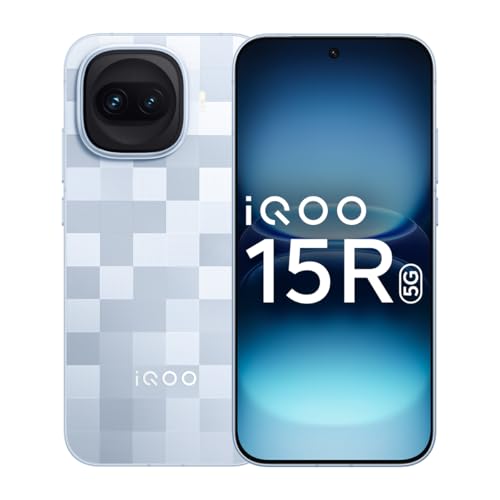
PhoneiQOO 15R 5G
5000nits Display · Top-Tier Camera · Fast Charging
- 5000nits peak brightness
- Flagship camera system
- 100W fast charging
 Phone
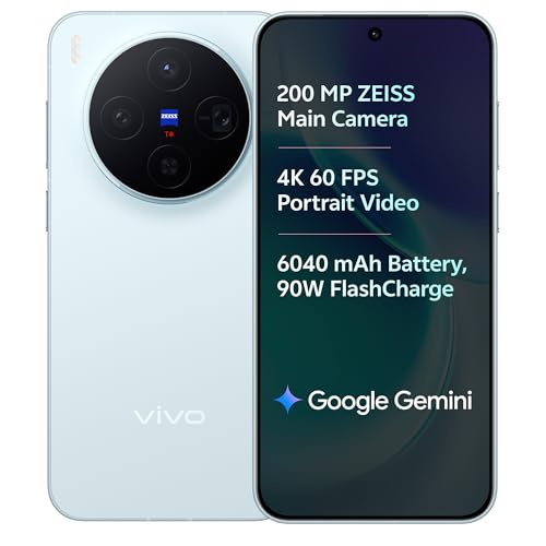
Phonevivo X300 5G
Dimensity 9500 · ZEISS Camera · 90W Fast Charge
- ZEISS optics camera
- Dimensity 9500 chip
- 90W rapid charging
Disclosure: As an Amazon Associate, we may earn from qualifying purchases. Prices may vary.
Try our free Color Palette Generator to build your palette in seconds.